

The Overlooked Threat of Decision Fatigue
Trade shows are fast-paced environments filled with opportunities—and stimuli. Attendees are bombarded by flashy visuals, eager salespeople, digital screens, and promotional giveaways at every turn. While this energy is what makes trade shows exciting, it can also lead to an invisible yet impactful challenge: decision fatigue.
Decision fatigue occurs when people are overwhelmed by too many choices in a short amount of time, leading to mental exhaustion, indecision, or avoidance. For exhibitors, this means that even the most visually stunning booth can be ignored if it's too complex or chaotic. Simplifying the attendee experience within your booth isn’t just a design preference—it’s a conversion strategy.
In this article, we’ll break down the causes and symptoms of decision fatigue at trade shows, and explore industry best practices to reduce mental load, guide decision-making, and boost booth performance. Whether you're renting a booth or planning a custom design, these tips from KSM Exhibits will help you craft a smarter, more effective exhibit space.
Understanding Decision Fatigue: What It Is and Why It Matters
What Is Decision Fatigue?
Decision fatigue refers to the deteriorating quality of decisions made by individuals after a long session of decision-making. In the context of a trade show, attendees are constantly deciding:
-
Which booth to visit
-
What product to look at
-
Who to talk to
-
What literature to take
-
Whether to scan a badge or request a follow-up
The cumulative effect of these small decisions leads to a kind of mental burnout, where visitors begin to default to inaction—they ignore your booth altogether or rush through without meaningful engagement.
The Trade Show Environment: A Decision Minefield
On a crowded show floor, the average attendee can face:
-
Hundreds of exhibitor options
-
Numerous competing demos and pitches
-
Frequent noise and visual interruptions
-
Constant physical movement and standing fatigue
Without a strategic approach to booth design and communication, your message gets lost in the noise.
Best Practices to Reduce Decision Fatigue in Your Booth Design
1. Streamline Messaging: One Key Idea, Not Ten
Don’t try to say everything at once. Visitors should understand what you do and why it matters within the first 5 seconds of seeing your booth.
Tips:
-
Use a bold headline or tagline with no more than 7–10 words.
-
Display your primary value proposition at eye level.
-
Avoid cluttered brochures or overcrowded text on walls.
Example:
Instead of listing ten product features, highlight one major benefit:
“Automated Inventory Software That Saves You 30+ Hours a Month.”
2. Offer Clear Navigation and Zoning
A booth with unclear zones creates confusion and increases mental effort. Instead, guide people intuitively through your space.
Tips:
-
Use flooring changes, lighting, or partitions to signal different areas (e.g., demo zone, product showcase, private meeting).
-
Create a “hero zone” at the entrance that highlights your top product or solution.
-
Limit the number of physical engagement points to 2–3 max.
Example:
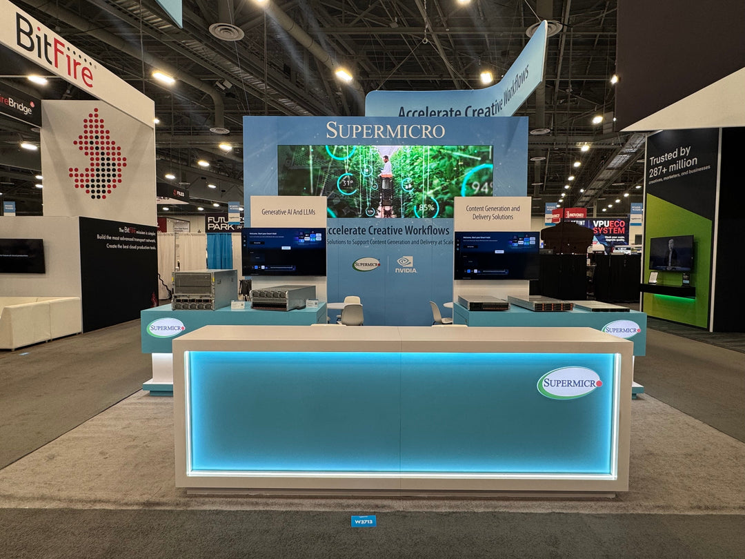
A booth with a central island and two flanking demo stations can help visitors explore in a natural, non-overwhelming flow.
3. Reduce Cognitive Load with Visual Hierarchy
Humans process images faster than text. By designing with a clear visual hierarchy, you can direct attention without making people think too hard.
Tips:
-
Prioritize large, simple imagery over data-heavy graphics.
-
Use contrasting colors and consistent fonts to create order.
-
Reserve movement (e.g., digital screens) for one focal area—not everywhere.
Example:
Instead of multiple rotating screens, feature one high-quality animation explaining your product in 30 seconds.
4. Pre-Qualify Engagement with Smart Signage
Too many choices can lead to disengagement. Smart signage helps attendees self-select their interest level and path forward.
Tips:
-
Use tiered messaging: general appeal on the outside, deeper info inside.
-
Post FAQs or “Who This Is For” signage to speak directly to specific buyer types.
-
Display benefits, not specs, unless asked.
Example:
“Are You Struggling with Project Delays? → Let’s Talk Solutions.”
This immediately attracts the right people without overwhelming them with technical jargon.
5. Minimize Choices During Engagement
Once someone enters your booth, too many options can cause them to freeze. Your team should guide the interaction with a clear call to action.
Tips:
-
Limit giveaways or demo choices to 1–2 main options.
-
Use a structured conversation script or engagement flow.
-
End each interaction with one clear follow-up choice (e.g., schedule a call, download the app, scan badge for a sample).
Example:
After a quick conversation:
“Can I send you a free case study or schedule a demo next week?”—not both.
6. Use Technology Intentionally, Not Excessively
Interactive tools are powerful, but only when they serve a purpose. Avoid decision fatigue by ensuring your tech is intuitive, purposeful, and optional.
Tips:
-
Make sure your touchscreen, VR, or app has a clearly defined use (e.g., try a product, take a quiz).
-
Include a staff member to assist and answer questions.
-
Avoid loading visitors with mandatory registration steps just to engage.
Example:
A simple touchscreen quiz: “Which Product is Right for You?” with three options and instant results—easy, fun, and useful.
Current Trends: Less is More in Modern Booth Design
The trade show industry is shifting toward minimalist, intentional design, especially as attention spans shrink. Here are a few design trends aligned with reducing decision fatigue:
1. Open Concepts with Guided Flow
Modern booths are ditching walls for open layouts that invite visitors in without forcing them to commit immediately. Subtle design elements guide foot traffic organically.
2. Smart Lighting & Mood Zones
LEDs, spotlighting, and ambient backlighting are being used to highlight key areas without relying on signage alone.
3. Soft Seating and “Pause Points”
Attendees appreciate places to sit and recharge, mentally and physically. Use this space to display a single, focused message or offer a simple takeaway.
How KSM Exhibits Helps You Design for Cognitive Ease
At KSM Exhibits, we understand that attention is your most valuable resource on the trade show floor. That’s why we specialize in designing custom and rental booths that not only attract attendees but guide them through a stress-free, decision-friendly experience.
Our Approach Includes:
-
Strategic content planning to focus your message
-
Visual hierarchy analysis to reduce clutter
-
Flow mapping to control traffic and guide interaction
-
Interactive elements that are both intuitive and purposeful
-
Smart signage and call-to-action placement
Whether you're working with a 10x10 space or a large island exhibit, we’ll help you simplify choices and maximize conversions.
Quick Checklist: Is Your Booth Decision-Fatigue Proof?
|
Element |
Status ✅/❌ |
|
One clear headline |
|
|
1–2 main CTAs only |
|
|
Defined zones & flow |
|
|
Limited interactive elements |
|
|
Visual hierarchy is clean |
|
|
Targeted signage |
|
|
Staff trained to guide steps |
|
|
Tech is purposeful & optional |
Use this checklist to evaluate your current booth design or plan your next one. Less confusion means more conversions.
Win More by Asking Less
Reducing decision fatigue isn’t about offering less value—it’s about delivering clarity, simplicity, and direction in an environment designed to overwhelm. By streamlining your booth’s messaging, layout, and engagement strategy, you help visitors make faster decisions—and more of them in your favor.
Let KSM Exhibits help you design a booth that cuts through the chaos.
Let’s Build a Smarter Booth Together
Ready to turn your trade show booth into a focused, high-performing engagement zone?
Contact KSM Exhibits today to explore custom designs or rental options built with psychological strategy in mind.