
In the competitive world of trade shows, where attention spans are short and first impressions count, color is more than decoration—it’s a powerful psychological tool. From driving foot traffic to influencing emotions and decision-making, color psychology plays a crucial role in booth design.
At KSM Exhibits, we understand that booth success is not just about structure and function—it’s also about the emotional experience. This guide explores how color choices can shape attendee behavior, support brand messaging, and drive conversions.
Why Color Psychology Matters in Trade Show Booth Design
Color psychology is the study of how colors influence human perception and behavior. At trade shows, where your booth competes with hundreds of others for attention, the right color palette can:
-
Grab attention quickly
-
Establish brand identity
-
Evoke emotional responses
-
Influence purchasing decisions
-
Encourage booth engagement
According to studies, people form up to 90% of their initial judgment of a product or environment based on color alone. In just a few seconds, your booth’s color scheme can draw visitors in—or push them away.
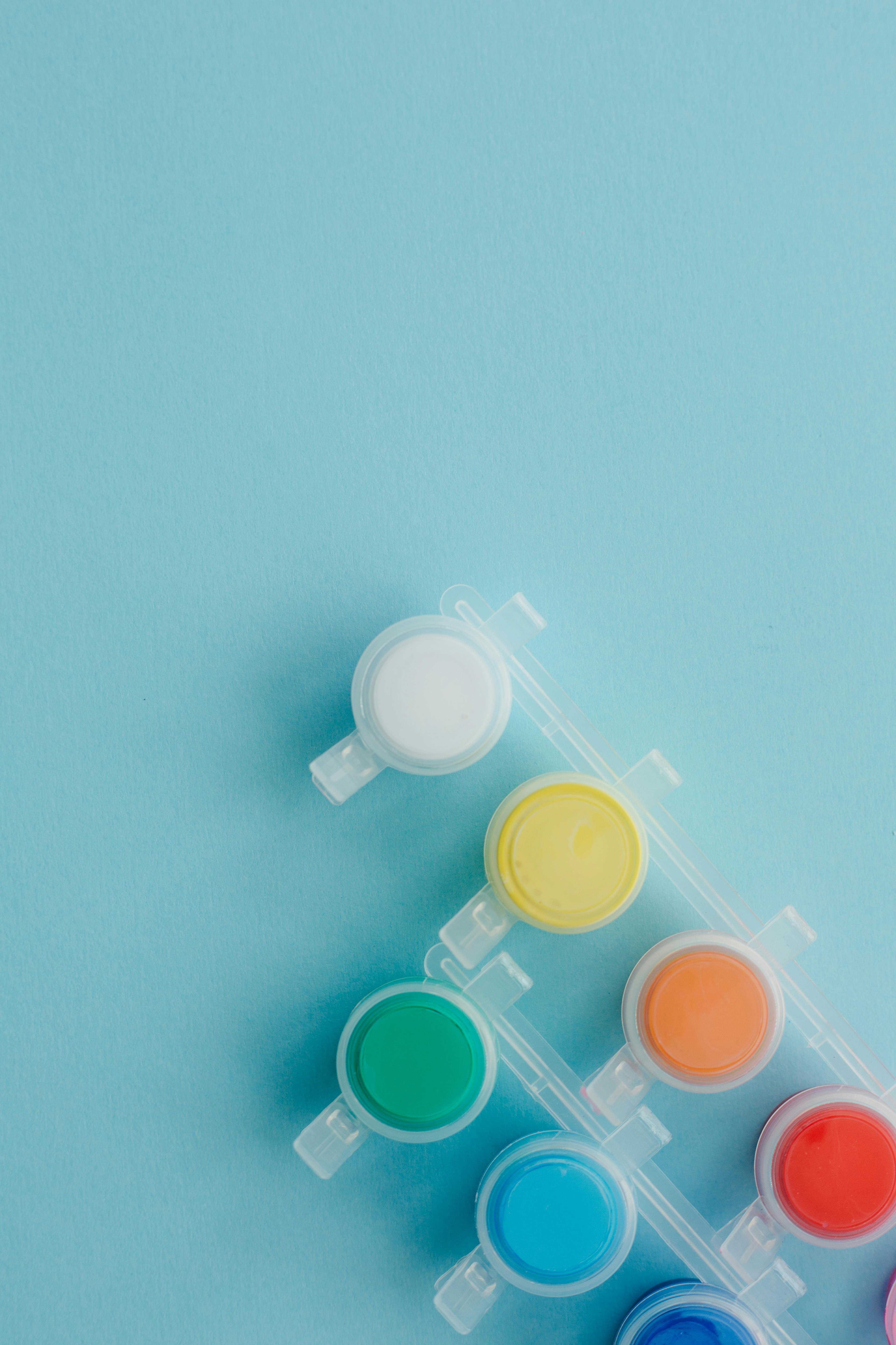
The Basics: What Different Colors Communicate
Different colors trigger different psychological responses. Here’s a breakdown of common colors used in trade show design and their associated emotions or meanings:
|
Color |
Psychological Impact |
Best For |
|
Red |
Urgency, excitement, passion |
Promotions, giveaways, energy products |
|
Blue |
Trust, calm, professionalism |
Tech, finance, healthcare |
|
Green |
Growth, health, sustainability |
Eco-friendly brands, agriculture, wellness |
|
Yellow |
Optimism, warmth, attention-grabbing |
Retail, startups, cheerful environments |
|
Orange |
Creativity, enthusiasm, friendliness |
Entertainment, sports, food brands |
|
Purple |
Luxury, imagination, innovation |
Beauty, education, premium services |
|
Black |
Power, sophistication, elegance |
High-end brands, luxury goods |
|
White |
Cleanliness, simplicity, neutrality |
Minimalist booths, health, technology |
|
Gray |
Balance, professionalism, conservatism |
B2B, corporate, legal or industrial sectors |
Tip: Combining colors strategically—like blue and white for trust and cleanliness—can communicate more complex messages.
How Color Influences Attendee Behavior
Color affects attendees at both conscious and subconscious levels. Here’s how booth colors shape behavior at every step:
1. Attracting Attention from Afar
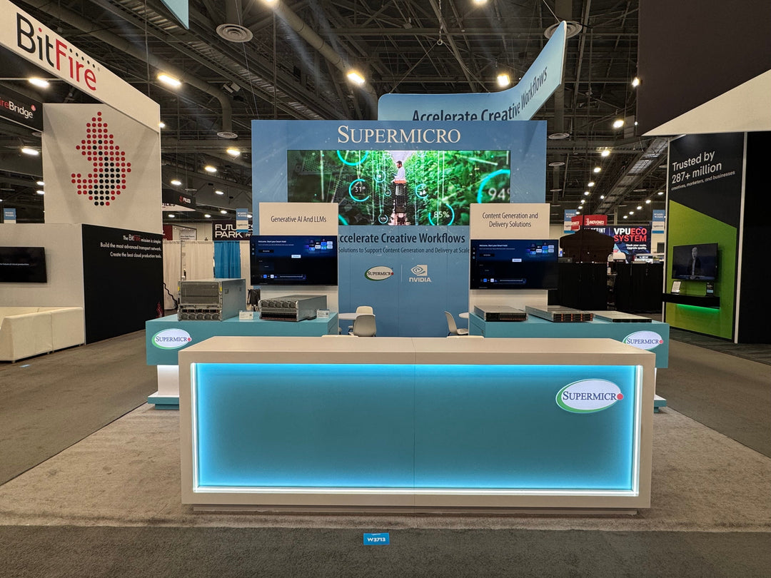
Trade show floors are often visual overloads. Bright, warm colors like red, orange, and yellow are excellent for visibility and can help pull attendees from across the aisle. Cooler colors like blue or green are more calming but can still stand out when paired with bold accents or lighting.
Example: KSM Exhibits helped a beverage brand boost visibility at a crowded food expo by using an orange-and-white color scheme with LED lighting, resulting in a 30% increase in foot traffic over their previous exhibit.
2. Creating a Specific Mood
The atmosphere inside your booth sets the tone for interactions. Want to encourage longer conversations? Use calming tones like blue or green. Want a sense of urgency for limited offers? Use red accents.
Practical Tip: Use warm lighting to make bright colors feel inviting rather than harsh. Conversely, cooler lighting can help blue hues feel more clinical and professional—ideal for medical and tech spaces.
3. Guiding Attendee Flow
Strategic color blocking can guide movement and focus attention. For example, a darker background with a vibrant central call-to-action area (like a red or yellow display) naturally draws the eye.
Design Hack: KSM Exhibits often uses contrasting floor graphics or colored zones to help attendees intuitively understand where to go next—whether toward demos, consultations, or product displays.
4. Reinforcing Brand Identity
Colors should not just look good—they should align with your brand palette and industry expectations. Consistent use of brand colors builds trust and memorability.
Example: A health tech client of KSM Exhibits used a blue-and-green booth to mirror their branding and signal innovation plus wellness. The result? Stronger brand recall in post-show surveys.
Color Combinations That Convert
Instead of relying on a single color, effective booths often use a strategic combination of primary, secondary, and accent colors.
The 60-30-10 Rule
A timeless design principle:
-
60% Dominant Color (main backdrop or walls)
-
30% Secondary Color (furniture, flooring, signage)
-
10% Accent Color (call-to-action elements, buttons, giveaways)
Example Combination for a Tech Startup Booth:
-
60% White (clean, modern backdrop)
-
30% Blue (trust and innovation)
-
10% Orange (call-to-action energy)
Contrast Matters
High-contrast colors (e.g., black and white, red and yellow) are great for readability and grabbing attention. But too much contrast can feel chaotic—balance is key.
Pro Tip: KSM Exhibits always tests colors under realistic lighting conditions before final fabrication to ensure readability and aesthetic harmony.
Color and Industry: Tailoring Hues to Your Market
Different industries have different expectations when it comes to color usage. Here’s how to align color choices with your sector:
-
Healthcare: Use calming colors like blue, white, and green to inspire trust, safety, and hygiene.
-
Technology: Blues, blacks, and metallics feel sleek and future-forward.
-
Retail/FMCG: Warm colors like red, yellow, and orange work well to create urgency and friendliness.
-
Luxury Brands: Deep shades like black, gold, or purple convey exclusivity.
-
Eco-conscious Products: Greens and earth tones reinforce sustainability messaging.
Trends in Color Usage for Modern Booths
Color preferences evolve with time, and staying current keeps your booth relevant. Here are some emerging color trends in booth design:
1. Biophilic Design and Earth Tones
Greens, browns, and natural textures are trending as more brands push sustainability.
2. Muted and Pastel Palettes
Modern, minimalist, and calming. Ideal for wellness, fashion, or creative industries.
3. Monochrome With Bold Accents
Black-and-white or grayscale schemes, punctuated by one strong color (e.g., neon orange), create visual drama.
4. Color-Changing LED Lighting
Smart LED systems allow booths to shift color throughout the day, capturing different moods and keeping visuals dynamic.
Mistakes to Avoid with Color in Booth Design
Even with good intentions, color mistakes can cost you leads. Here’s what to watch out for:
-
Overuse of bright colors: Can feel overwhelming or juvenile.
-
Low contrast between background and text: Hurts readability.
-
Ignoring lighting: Colors look very different under halogen, fluorescent, or natural light.
-
Clashing palettes: Poor coordination can make your booth appear unprofessional.
-
Forgetting your brand: Trendy colors are fine—but they should always serve your message.
How KSM Exhibits Approaches Color Strategy
At KSM Exhibits, color isn’t an afterthought—it’s a foundational element of booth design. Our design process includes:
-
Color psychology consultation tailored to your goals
-
3D renders and mockups with full palette previews
-
Testing under real trade show lighting
-
Brand integration to maintain consistency across physical and digital spaces
Whether you're renting a modular setup or investing in a custom build, our team ensures your booth colors support your objectives and resonate with your target audience.
Final Thoughts: Let Color Work for You
Color is one of the most powerful, and often underestimated, tools in your trade show arsenal. When used strategically, it can:
-
Attract attention
-
Strengthen brand identity
-
Guide behavior
-
Boost booth engagement
-
Increase conversions
With KSM Exhibits as your partner, we’ll help you unlock the full potential of color to make your booth not just look amazing—but perform exceptionally.
Ready to Build a Booth That Stands Out?
Let’s bring your brand to life through expert booth design that goes beyond the basics. Contact KSM Exhibits today to explore how our color strategies and fabrication expertise can elevate your next trade show presence.